- DATE:
- AUTHOR:
- Team LaunchNotes
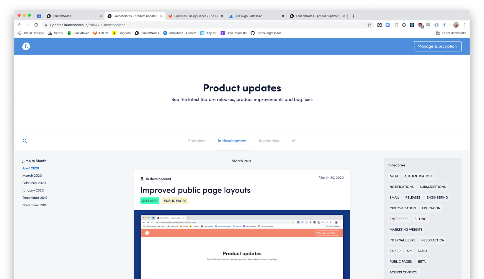
Improved public page layouts
Our new public page design system will make your public pages more approachable and impactful. Releases will be easier to find and groups of releases will be easier to scan.
LaunchNotes liberates your product changes from the depths of blogs, help docs and one-off emails. Releases deserve a dedicated home that's as functional as it is pleasing to the eye. We can't wait for you and your customers to use the new Public page layouts.
What's changing with Public pages
New layout for main public page and individual release pages
New color system and themes
3 choices of layout density
Filter by category
Search capability
Update timeline for individual release pages
When is it rolling out?
This is rolling out Wednesday April 15th, 2020
Why we did it
Communicating change
Companies have different needs when communicating their product changes. You may release frequently and communicate every change. You may also do a monthly or version based roundup. Our new layout density picker for public pages helps you pick a style that suits your communication strategy.
Finding an answer
Finding an answer about change is sometimes super specific. Sometimes it's more fuzzy. Sometimes you're not looking for anything and you just want to poke around. Search, status tabs and category filters help your visitors consume your updates no matter what they're looking for.
Ready to go
LaunchNotes should make it easy for your Launch home to be informative, easy to navigate, AND visually appealing. Having something out of the box that looks great and can match your brand is an important piece of LaunchNotes. Your changes are the star of the show and LaunchNotes is keen to give them a proper stage.
Detailed overview
New layout
On the new public page layouts you'll see several new elements (outlined below) to help your public visitors answer the question of "What's changing and when?"
Search by Release title or summary
View Releases by month
Filter by Release status
Filter by Release category

Layout densities
You now have the ability to pick from a compact, normal or comfortable density layout under your project settings.
The Compact layout
Cards show current status, whether or not a card has updates, most recent public updated timestamp, Release title, and category. This layout is best if you make frequent changes and want to display many Releases on your public page.

Normal layouts
Strike a great balance of providing more information while keeping your public page scannable. Normal layout cards display status, last public update timestamp, release title, release summary, categories, hero image and number of updates.

Comfortable layouts
Display as much information as possible on the card view of your Releases. Comfortable layout cards show all the same information as a normal card with the addition of the latest update if there is one. Categories also pull in their respective colors.

Updates timeline
The new "timeline view" posts all the public updates for a given Release after you've added it to your public page. We'll also include status changes to help orient your visitors when they're following one of your Releases.

Updates with release article
If your release has an article we'll collapse the timeline and allow visitors to expand it if they want.

What's next?
Take a look at our page (https://updates.launchnotes.io/?view=complete) and poke around to see the changes live.
Updates timeline, new layout and the color system all come automatically. To set colors and density layouts for your public page head over to project settings >> look & feel. We can't wait to see your new public pages!
Have feedback or other great ideas? Answer our two question survey - https://tylerdavis781690.typeform.com/to/cWsUVG