- DATE:
- AUTHOR:
- Team LaunchNotes

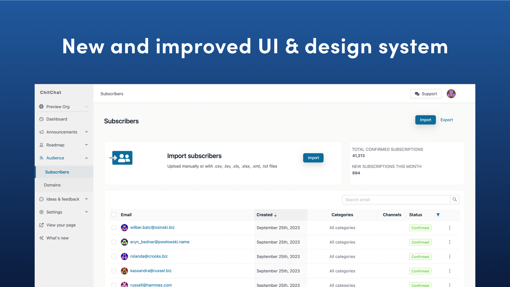
Shipping tomorrow: an updated design system for the management portal
Tomorrow we’re releasing a major UI update to the LaunchNotes management portal that will optimize your product communication workflows while making the LaunchNotes experience more intuitive, visually pleasing, and efficient than ever before!
Because we know humans are creatures of habit and change can be scary, we wanted to let you know a day ahead of time. But to be very clear: There are no changes to placement or functionality—everything is staying exactly where it is. What’s shipping is a refreshed and refined UI and design system we know you’re going to love. 

The updates focus on:
Intuitive navigation with consistent layouts, buttons, and icons so you can work seamlessly across all portal pages
Common elements like search bars, user menus, and primary action buttons now have consistent styling and presentation
Clean, minimalist aesthetic for clarity: we're using white space, clear hierarchies, and thoughtful typography to guide your focus to the most important content and actions
Purposeful color palette that highlights key actions: through the strategic use of color on interactive elements, we're directing attention to the buttons and links that move you efficiently through key workflows. Color contrasts have also been improved for accessibility
The result is a win-win! An intuitive, uncluttered interface that gets out of your way, making it easier to manage your LaunchNotes projects and share your product comms efficiently. And implementing the updated design system and standardizing components (layout, navigation, buttons, imagery, color, fonts) creates a consistency and foundation for all future LaunchNotes experiences and feature releases.
Got feedback?
Dive into the portal, explore, and let us know what you think. Your feedback has always been our compass, and we're eager to hear your thoughts on the new look and feel. Please leave your feedback on this announcement in the upper left-hand corner of the page.


