- DATE:
- AUTHOR:
- Team LaunchNotes
- RELATED ROADMAP ITEMS:
- Project analytics - executive dashboard
Drive actionable insights at scale with automated topic modeling and product analytics
Over the past three weeks we’ve shipped three big new features:
From turning technical specs into a beautiful draft announcement in seconds, to unlocking product teams’ ability to manage feedback at any scale, to surfacing valuable subscriber data and insights across individual users and organizations, our R&D team has been on a tear this past month. And based on the overwhelming, positive feedback we’ve received from users, this speed of innovation hasn’t gone unnoticed!
And so we asked ourselves: why stop now? After all, what’s better than going three for three? Going five for five! 
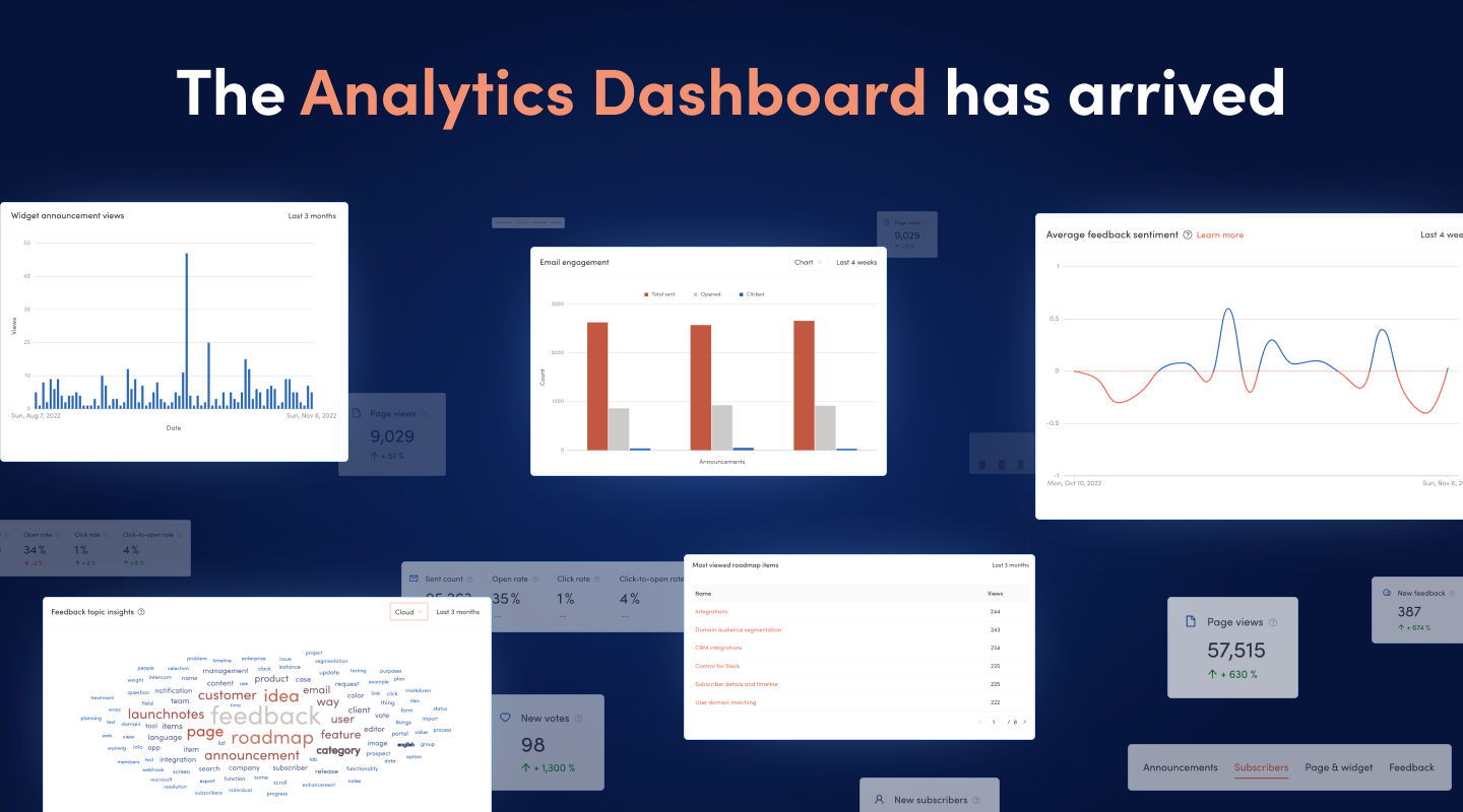
Today we’re back with two more massive improvements to the LaunchNotes platform: Automated topic modeling and a new executive-level analytics dashboard. Together, these two new capabilities will empower product teams to instantly see and act on opportunities at both ends of the product development lifecycle. With automated topic modeling, Bernie, your AI assistant enables product managers to see, at a glance, what their users are most interested in and what features should be prioritized next. And in tandem with a brand new analytics dashboard that surfaces everything from the most viewed roadmap items, to subscriber sentiment plotted over time, to subscriber activity and growth your entire team now has performance data of the entire product development pipeline at their fingertips.
But enough marketing speak. Let’s get into the nitty gritty of what we’re shipping today!
First up is topic modeling, featuring a brand new skill that Bernie has trained herself to help with. Last week Bernie began plowing through feedback to bubble up the sentiment of subscribers and organizations. This week she’s back to begin sifting through your subscriber feedback and pull out the insights for you (at any scale!).
Automated topic modeling
Customer feedback can be a goldmine of information. A customer's experience with your product can drive the difference between a strong, ongoing relationship and an account that might be showing signs of churning out of the business.
However, it's not easy to identify and extract topics from large collections of customer feedback. That's where Bernie comes in. We’ve pointed her at all of the text in all of your feedback items to extract and surface prominent, recurring words and themes to help you identify what is top-of-mind for your users so you can accurately prioritize and deliver the product experiences most important to them.
Topic modeling, available today for LaunchNotes customers on Business and Enterprise plans, will scan all of the feedback items you have received over a selected period of time, detect words and phrases within the text of the feedback, and automatically cluster keywords used most frequently.
Making it easier to extract and surface customer insights buried in user feedback, we hope to reduce the signal-to-noise ratio in feedback and enable you to substantially improve your product success with your user base.
Next up, is the analytics dashboard for your LaunchNotes project.
An executive-level analytics dashboard
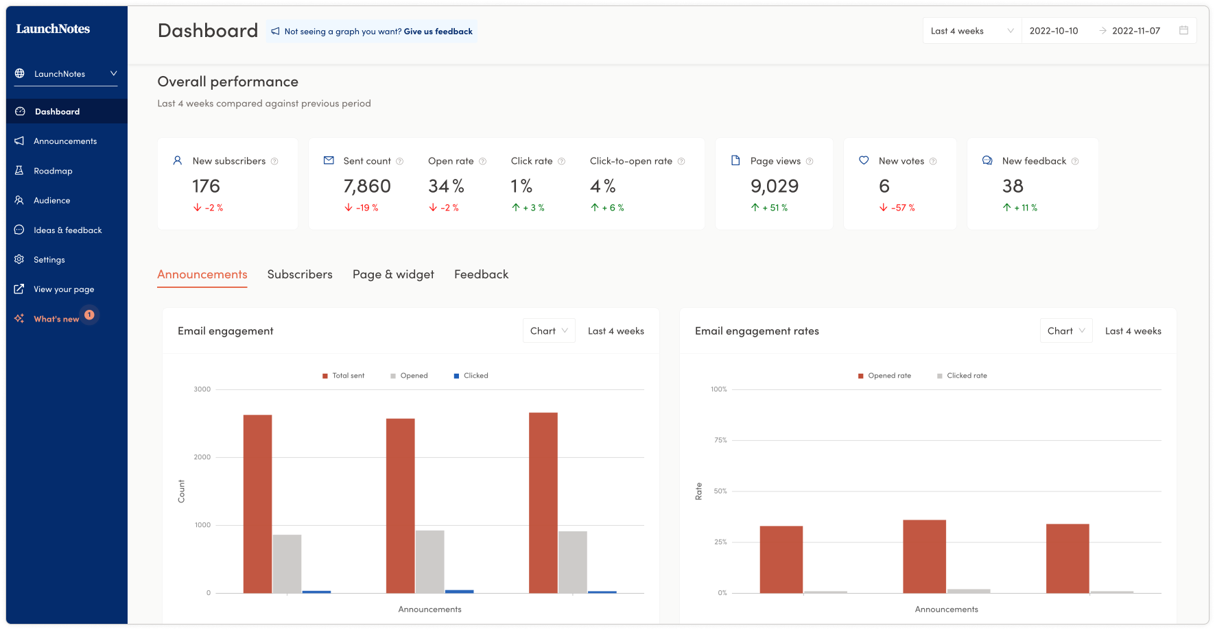
We’ve updated and improved the login experience so that instead of landing immediately on the announcements page in the management portal, you’ll by default land on your LaunchNotes analytics dashboard. The dashboard isolates and provides in-depth metrics for your announcements, subscribers, page and widget views, new votes, and new feedback. In this default view, performance is presented for the last 4 weeks across these core features, which is compared to the previous 4 weeks' performance.
Let’s dive first into the date range selector at the very top of the page.
Date range selector
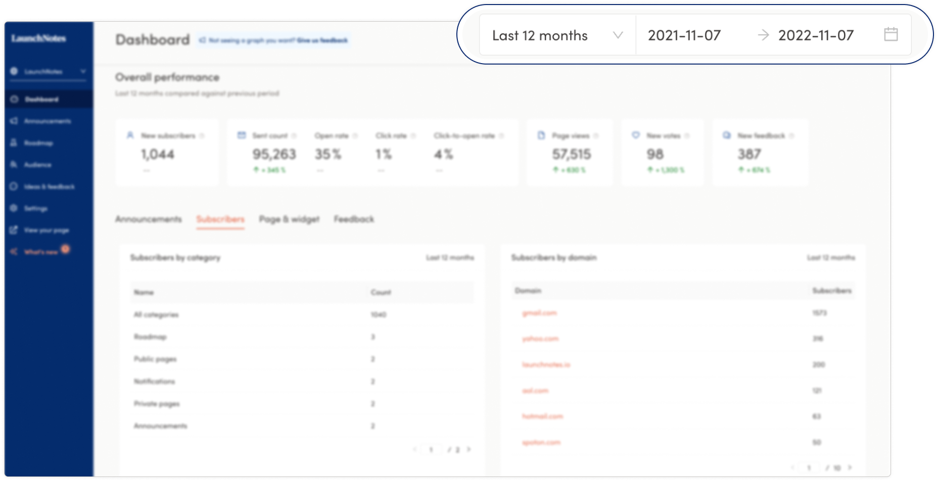
You can use the dashboard date range selector to view your project's performance across a variety of date ranges. The default setting shows data from the last four weeks, but you can adjust it to show data from as far back as “year-to-date” to as recent as “today” or the “last 7 days.” You can also select a custom range.
The custom date range can be helpful when cross-referencing disparate data points within the dashboard. For example, you might identify a relationship between subscriber growth with a feature that was shipped and announced in the same timeframe. And from there, investigate if the feature is associated with a category popular with your userbase or perhaps that particular feature is driving higher rates of usage and team adoption. With a custom view, you can compare and contrast these relationships to help you better understand how your subscribers are interacting with your product development and your product communications.
Overall performance metrics
Next, we’ll move down the dashboard to the overall performance metrics, which are persistently present as a row across the top of the page no matter where you might navigate in the dashboard.

The first metric displayed in overall performance is for subscribers. This displays new subscriber growth over the selected period of time as well as the performance of that period’s subscriber growth compared to the previous period of the same time range, which can be positive or negative in the comparative view. This period-over-period metric is positioned directly below all of the metrics in the overall performance row. The second set of metrics displayed is for announcements. This displays a breakdown of how many total announcements were sent out over the date range as well as the open rate, click rate, and click-to-open rate. The third metric displayed is page views: this displays the sum total of times your subscribers viewed all pages (announcements, roadmap items, widget) during the selected period.
Following that, the next 2 metrics are the number of new votes (if you have that enabled) cast and the count of feedback provided by your subscribers.
The number of new votes cast is a great way to gauge your subscriber engagement. The more votes cast, the more engaged your audience is with the published ideas your team is planning and prioritizing.
The number of feedback items provides you with the number of feedback items you have received in the selected date range. If you're getting a lot of feedback, this could mean your subscribers are engaged and positive with what you’re planning, prioritizing, and shipping or it could mean that there are some negative-trending issues that might need to be addressed. Either way, this gives you a new diagnostic to help indicate the next best action to take based on what your subscribers are telling you.
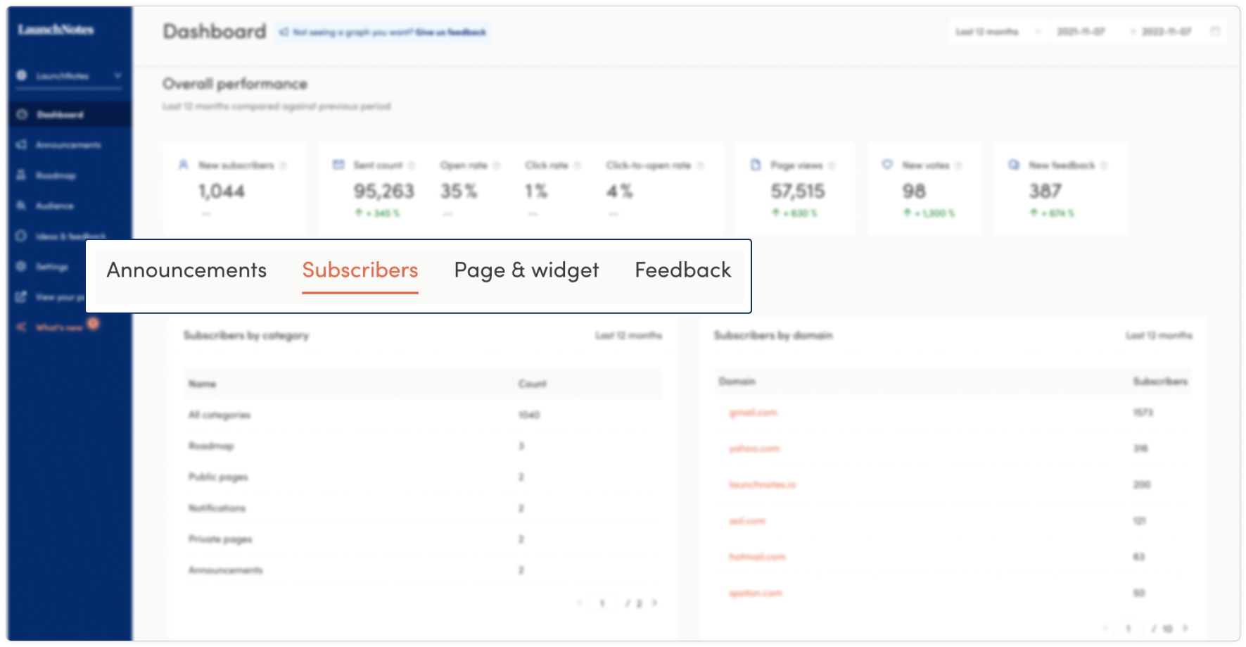
Navigation tabs and tables for deeper insights
The next key components of the dashboard are the navigational tabs that allow you to dive deep into the specific metrics across your announcements, subscribers, page and widget, and the feedback you have received.
Announcement analytics
The announcements table provides two views: one for the actions your email notifications (total sent, opened, clicked) are driving as well as another view that highlights the rates of engagement, email open rate, and click-rate performance. There’s a toggle option for both data sets, allowing you to see a graphical representation of the performance data of the same performance metrics presented in a chart with a list of the announcements sent with linked titles that take you to a specific announcement for quick reference.
Both tables allow you to select or deselect fields in the legend of the graph to focus on individual metrics. This is particularly helpful when reviewing the data over longer date ranges like the “last 12 months” as it simplifies and focuses the data presented.
For LaunchNotes customers on Business and Enterprise plans, we’ve built an even greater level of granularity to help derive insights by tracking which days and what time of day an email notification is sent and how that timing drives performance as measured by open rates. One graph identifies open rate performance by the day an announcement was sent and the other graph surfaces the response rate of an email notification by the hour of the day it was sent (timezone is displayed in UTC +0).
With these advancements, we’re confident you'll have new levers for managing the performance and optimization of your email notifications.
Subscriber analytics
The subscriber table is a new way to view and think about your subscribers. It shows you two charts: 1) subscribers of the categories you have created for your LaunchNotes page, which will show the total count of subscribers to “all categories” and the count of subscribers to individual categories in descending order; 2) the other chart - available only on Business and Enterprise plans - highlights the subscribers of categories broken out by domain, typically a reliable proxy for a customer account. In the subscribers by domain table, you're able to click into each domain to bring up the domain Info panel, for a deeper dive into how subscribers of a particular domain are interacting with your published page. Both of these tables have a bi-directional nav button in the lower right-hand corner to advance through all the pages available in these charts.
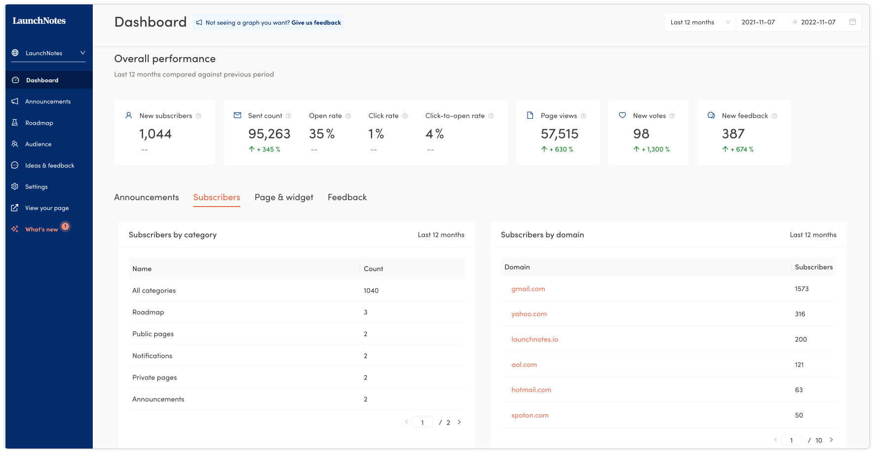
Centralizing the subscriber data equips you with a new way to monitor, manage, and grow your subscriber base: what categories are driving the most interest and views and what domains are most engaged with your product development, and which are the least engaged – offering you an entry-point to better understand what is driving strong engagement and how might that insight be applied to strengthen accounts that have the potential for much higher subscriber counts.
Page & widget analytics
The page & widget table provides a table view of the most viewed announcements, and the most viewed roadmap items as well as a chart presenting the total number of views of announcements via your LaunchNotes in-app widget if you are using one. With the widget announcement views, when you hover over the bars in the graph, you will see the count of views and the day those views were recorded.
With this data gathered all in one table, you can quickly see announcement performance by views relative to all the announcements of the selected date range.
For roadmap items, selecting through different date ranges, you can begin to see historical and trending interest in the features on your roadmap.
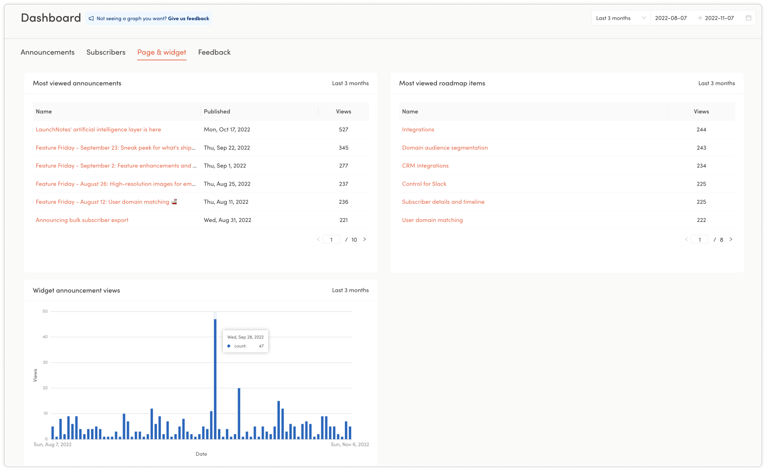
And for widget views, a spike might tell you that a particular release was particularly compelling to your subscribers that use the widget. Looks like our subscription management update on September 27th sparked some interest!
Feedback analytics
For feedback, all plans have access to the overall performance snapshot at the top of the dashboard page. Business and enterprise plans have access to three additional data sets to better analyze and understand feedback.
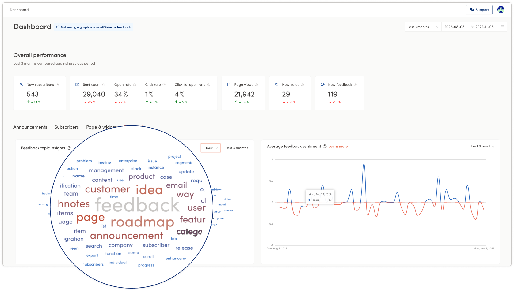
Automated topic modeling: In the feedback topic insights (presented as a word cloud or table), Bernie, your AI assistant, scans all of the feedback you have received over the selected period, detects words and phrases within the feedback, and automatically clusters keywords with the highest volume. Even better, click on a word in the cloud to navigate directly to the feedback inbox, automatically filtered to only the relevant pieces of feedback associated with that word! - fast-tracking your understanding of what is important to your customers and how you might respond.
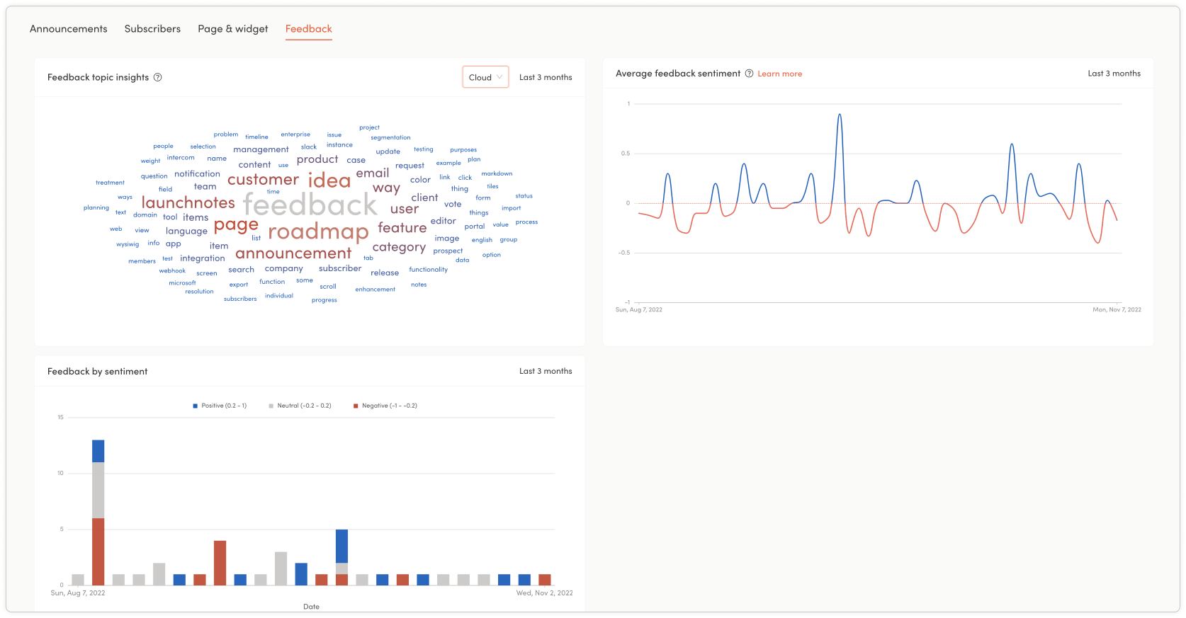
Average feedback sentiment: this graph provides you with a representation of the positive and negative sentiment in the content of your feedback over the selected date range, along with specific sentiment scores associated with specific dates - outfitting you with a bird’s eye view of how sentiment is trending and an entry point to investigate strategies to optimize the positive sentiment and address the negative.
Feedback by sentiment: this chart gives you a snapshot of the sentiment represented in a bar chart with positive, neutral, and negative feedback values for the selected date range. When you hover over the individual bars, you’ll be presented with a specific date and the number of sentiment scores broken out from positive to negative - provisioning you with another perspective on how your subscribers are responding to your product development and product communications.
We'd love to get your feedback
At the very top of the dashboard, we placed a feedback button so you can tell us what additional analytics and charts you may want to see in the future to help drive your product success.
Some of the ideas we’re already thinking about to make the dashboard even more useful and powerful:
A view of your email notification performance compared to an average of other companies
A visual representation of how your published ideas are trending
A chart showcasing feedback items that have the highest and lowest sentiment scores
The ability to easily download dashboard data and metrics to create beautiful presentation slides
And that’s just a few of the ideas we’ve been kicking around to further enhance the analytics dashboard over time. We’d love to hear your thoughts on useful metrics you'd like to see in the dashboards. Leave your feedback with this announcement or at the top of the dashboard within the management portal.
That's a wrap! Head over to your app.launchnotes.com account to check out your dashboard and the performance data within it today! 